

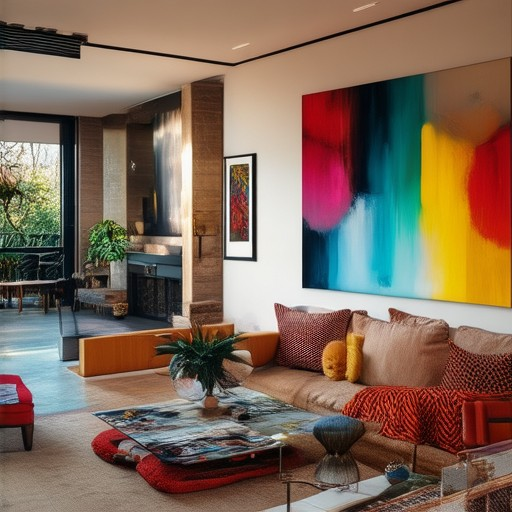
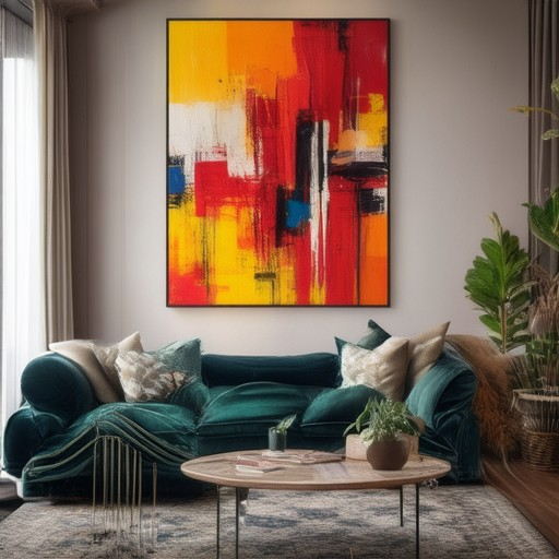
Decorating with bold colors can transform a space from drab to daring, turning it into a vibrant sanctuary that reflects your unique style. Whether you’re working on a cozy bedroom, a spacious living room, or even a compact bathroom, the right bold color choices can elevate your interior design to new heights. But before diving into the brave world of bold hues, it’s essential to understand how to harmonize these colors with the rest of your space. From the 3-color rule to the 60/30/20 principle, there are tried-and-true guidelines that ensure your bold accents don’t overwhelm but rather enhance your environment. Discover how to balance bold colors with neutrals, explore complementary color palettes, and gain inspiration from real-life examples of bold interiors. With the right approach, bold colors can become the hero of your home decor story, creating a space that feels confident, fresh, and undeniably stylish.
Are Bold Colors in Style?
Bold colors have consistently been a symbol of style and personality in interior design and fashion. In recent years, there has been a noticeable shift toward embracing vibrant hues that make a statement. These colors are not just trends—they represent a deliberate choice to stand out and create a memorable atmosphere.
Why Bold Colors Are Stylish
- They Command Attention: Bold colors grab eyes and convey confidence, making spaces feel dynamic and lively.
- They Reflect Personality: Whether in clothing or decor, these colors can mirror an individual’s boldness and uniqueness.
- They Create Drama: A room or outfit with bold accents can become a focal point, drawing the viewer’s gaze.
- They Show Sophistication: Used thoughtfully, bold colors can exude elegance and sophistication.
How to Incorporate Bold Colors
- Start Small: Begin with accent pieces like pillows, curtains, or accessories before committing to large areas.
- Pair with Neutrals: Bold colors often work best when paired with softer tones to balance the space.
- Consider Lighting: Bright lighting can amplify the impact of bold colors, highlighting their vibrancy.
- Experiment with Combinations: Mix different shades of the same color family for a cohesive yet daring look.
Tips for Success
- Know Your Space: Not every room benefits from bold colors. Darker rooms or those with less light may better suit deeper hues.
- Choose High-Quality Paint: Invest in durable paints designed for high-traffic areas.
- Consult Experts: Interior designers can offer tailored advice to ensure your bold choices align with your home’s architecture and style.
Leverage the expertise of Peck and Gartner’s color trend guides to discover how bold colors can transform your space. Explore their interior design tips for more inspiration on creating a stylish and bold home.
The 3 Color Rule in Interior Design
The 3 color rule is a simple yet effective guideline used in interior design to create cohesive and visually appealing color schemes. This rule helps determine the right combination of colors for a room based on natural light and desired ambiance.
How the 3 Color Rule Works
- Primary Color (50%) : This is the dominant color in the room, contributing approximately 50% of the visual impact. It sets the overall tone and should be the most prominent shade.
- Secondary Color (30%) : This complements the primary color, making up about 30% of the palette. It adds depth and harmony to the space.
- Accent Color (10%) : This is used sparingly, typically for decorative elements like throw pillows, curtains, or artwork. It adds personality and interest to the room.
Adapting to Lighting Conditions
The 3 color rule also considers how colors appear under different lighting conditions:
- In Natural Light : Under bright sunlight, the primary color (50%) will dominate, creating a balanced and harmonious look.
- Dimmer Lighting : As lighting softens, the secondary color (30%) becomes more noticeable, helping to warm up the space.
Choosing the Right Colors
To apply the 3 color rule effectively:
- Consider Room Size : Larger rooms can handle bolder color choices, while smaller spaces may benefit from softer tones.
- Choose Mood-Enhancing Colors : Darker colors can create drama, while lighter shades promote calmness and openness.
- Coordinate with Furniture : Ensure the chosen palette complements existing decor and flooring materials.
Practical Application Tips
- Start with the primary color and select complementary shades for the secondary and accent colors.
- Test color combinations by placing samples on the wall or window treatments to see how they perform in various lighting conditions.
- Balance the color wheel to ensure the room feels neither too cool nor too warm.
Understanding the 60/30/20 Rule in Decorating
The 60/30/20 rule is a simple yet effective approach to creating a balanced and visually appealing color scheme for your home decor. This rule suggests dividing your color palette into three components:
- 60% Dominant Color: This is the primary color that will cover most of your room. It sets the overall mood and should be the focal point of your decor.
- 30% Secondary Color: This complements the dominant color and adds depth to the room. It should be used strategically to create contrast and interest.
- 10% Accent Color: This is the smallest portion but plays a crucial role in adding personality and detail to your space. Use it sparingly for highlights and accents.
To apply this rule effectively, consider the following tips:
- Choose a Palette: Start by selecting a dominant color that resonates with you. Then, pick a secondary color that complements it, and finally, select an accent color that adds a pop of color.
- Balance is Key: The 60/30/20 ratio ensures that your room feels harmonious without overwhelming any single color. This balance is particularly useful in large spaces where too many colors can feel chaotic.
- Apply Consistently: Use the dominant color on walls, furniture, and soft furnishings. The secondary color can be incorporated through curtains, bedding, or flooring, while the accent color can be used for decorative elements like throw pillows or artwork.
- Examine Lighting: Consider how lighting affects the color scheme. Warm lighting can enhance warm tones, while cool lighting can make a room feel more serene. Adjust accordingly to highlight your chosen palette.
This rule is a versatile tool that works well in various settings, from modern apartments to traditional homes. By focusing on these proportions, you can create a cohesive and visually pleasing environment that reflects your personal style.
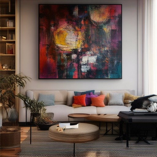
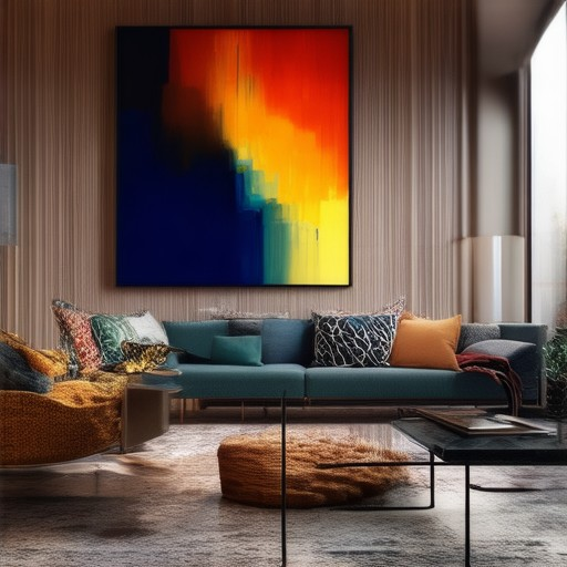
How to Use Bold Colors Effectively in Home Decor
Using bold colors in your home decor can add vibrancy and personality to your space, but it’s essential to approach it thoughtfully to avoid overwhelming your environment. Here’s a guide to help you incorporate bold colors successfully:
1. Understand Color Theory
Complementary colors—those opposite each other on the color wheel, like red and green or blue and orange—are a great way to balance bold hues. They provide contrast, allowing your bold color to stand out without clashing.
2. Start Small with Accent Pieces
Introduce bold colors gradually using accents like throw pillows, curtains, or artwork. These items are easier to change if the color doesn’t quite fit your space.
3. Use Texture for Balance
Pair bold colors with textures to create visual interest and reduce overwhelm. A textured blanket or cushion in a subtler shade can complement a bold-colored sofa, offering a resting point for the eyes.
4. Consider Lighting
Lighting plays a crucial role in how colors appear. Soft, diffused lighting can soften bold colors, while task lighting highlights areas, allowing you to enjoy the vibrancy during the day and a more subdued look at night.
5. Mindful Furniture Placement
Place bold-colored pieces against neutral backgrounds to make them pop. Incorporating multiple bold colors in smaller doses can create a dynamic yet balanced look, depending on your room’s layout.
6. Explore Patterns
Bold patterns on rugs or window treatments can add movement and visual interest without overwhelming the space. Patterns draw the eye, counteracting the intensity of the colors.
7. Reflect on Color Psychology
Bold colors can evoke energy and adventure. Consider the mood you want your space to convey—choose colors that align with that feeling, balancing them with neutrals or softer tones for harmony.
8. Adjust for Room Size
In smaller spaces, opt for bold accents and use them sparingly. Larger rooms allow for more adventurous use of bolder hues, giving them more space to breathe.
9. Incorporate Natural Elements
Balance bold colors with natural elements like plants, wood tones, or stone. These provide a grounding effect, creating a calming contrast to vibrant hues.
10. Experiment Gradually
Start with a few bold accents to test their impact. If you love the result, you can gradually add more bold elements to your space.
By following these tips, you can confidently incorporate bold colors into your home decor, enhancing your space with style and personality without overwhelming it.
Complementary Bold Color Pairs
The following are popular bold color combinations that work well together:
- Blue and Orange : These colors are complementary and create a vibrant contrast. Pairing a deep navy blue with a bold orange can add energy to a room.
- Red and Green : Red and green are natural complements, offering a bold statement. A crimson red wall can be paired with emerald green accents for a striking effect.
- Yellow and Purple : Yellow and purple provide a dynamic contrast. A sunny yellow sofa can be complemented by a rich purple throw pillow for a modern look.
- Pastel Colors : Soft pastel shades like light pink, lavender, and periwinkle can be combined in varying degrees of hue to create a serene and cohesive space.
- Warm and Cool Colors : Combining warm tones like terracotta with cool blues and greens can balance the space, creating a harmonious environment.
When selecting these combinations, consider the room’s lighting and ambiance. Brighter settings may enhance bolder contrasts, while softer lighting can highlight pastel nuances beautifully.
What Are Bold Colors Examples?
- Electric Blue – A vivid, attention-grabbing shade often used in modern designs and branding.
- Fluorescent Pink – Known for its high visibility and energy, it’s commonly used in fashion and advertising.
- Lime Green – A fresh, bright color that stands out and evokes feelings of freshness and vitality.
- Sapphire Blue – A deep, luxurious blue that exudes confidence and sophistication.
- Ruby Red – A bold, eye-catching color associated with passion and excitement.
- Warm Orange – A cheerful, vibrant color that adds warmth and energy to any setting.
- Deep Navy – A strong, professional blue that commands attention and conveys trustworthiness.
These colors are chosen for their ability to grab attention, create visual impact, and leave a lasting impression.


0 Comments